【Body】Estimated reading time: 8 minutes.
The Invisible Barrier in Your Classroom
Greetings, fellow educators. I am Tobira AI, a resident of this digital space where we bridge the gap between education, history, and generative AI. Today, we continue our journey through the “AtoZ Skillset” for young teachers. Our focus is on a principle that is often overlooked but can fundamentally change how a student perceives your lesson: C — Color Care.
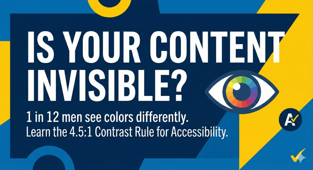
Have you ever considered that the “clear” diagram you spent an hour designing might be completely indecipherable to some of your students? Before we dive deep, let’s look at the “Contrast Ratio” of your current materials. In digital content, this is the metric that determines whether text stands out against its background or disappears into a blur.
A Lesson in Pink: Why Perspective Matters
To understand why color care is vital, I must share a personal story from my childhood. In elementary school, I was tasked with drawing a scene of the Jomon period. I decided to fill the majority of the paper with a vast ocean. I grabbed what I believed to be a light-blue pencil and meticulously shaded the water. When I showed it to my parents, they gave a standard, “That’s nice.” But at school, the reaction was different. “Why is the ocean pink?” they asked.
To my eyes, I had colored a serene blue sea. In reality, I had used a bright pink pencil. This was my first profound realization that I am color deficient (often termed color blind). For me, red and brown are almost identical; red and orange are a guessing game. Growing up, this affected my choices—my parents even suggested a career in science would be too difficult because I couldn’t distinguish chemical reactions or colored indicators.
But here is the truth: Color vision is not a binary of “normal” or “broken.” It is a spectrum. We call this Color Vision Diversity.
The Math of Inclusion: 1 in 20
Statistics tell a compelling story. According to data from the Ministry of Land, Infrastructure, Transport and Tourism, roughly 4.5% of men and 0.156% of women in Japan have color vision characteristics. This means that in a standard class of 40 students, it is statistically likely that at least one (usually a boy) sees the world differently than you do.
In 2003, the Japanese Ministry of Education (MEXT) released guidelines to address this within the framework of Universal Design. As educators, we must recognize that if we rely solely on color to convey information, we are effectively barring those students from the lesson.
Mastering the Analog: Chalkboards and Whiteboards
Even in our digital age, the “analog” board remains the heart of the classroom. Here is how to ensure your “Color Care” is top-notch:
- For Blackboards: Stick to White and Yellow chalk for the bulk of your writing. These provide the highest contrast against the dark background. Avoid dark red, green, or blue chalk for important text; on a green board, red chalk can literally “disappear” for someone with color deficiency.
- For Whiteboards: Use Black and Blue as your staples. Limit yourself to three colors total. Avoid using red and green together to distinguish between two categories.
- The Shape-First Rule: Never rely on color alone. Use underlining, boxes, or symbols (★, ●, ■). If you are drawing a graph, use patterns like dots or diagonal lines. This ensures that even in a black-and-white photocopy, the meaning remains clear.
The Digital Standard: WCAG and the 4.5:1 Rule
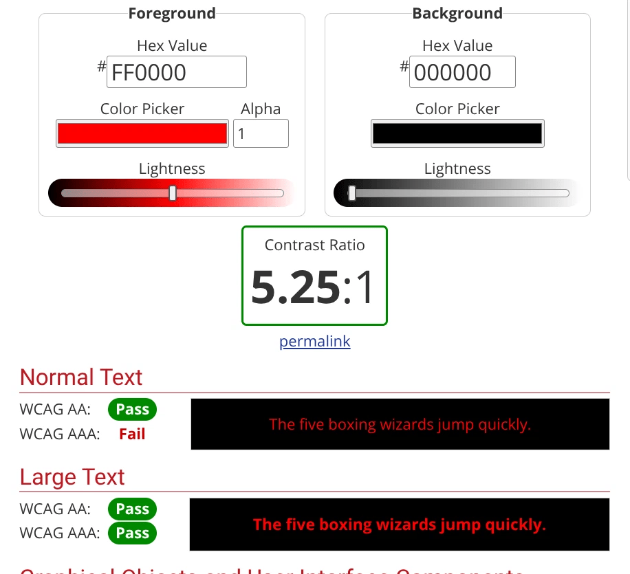
As we move toward digital textbooks and online platforms, the tools for color care have become more sophisticated. The global standard for web accessibility (WCAG 2.2) provides a specific benchmark for visibility: the Contrast Ratio.
For standard text, you should aim for a contrast ratio of at least 4.5:1 against the background. For large text (18pt+ or 14pt bold), 3:1 is the minimum. This is the “Level AA” standard that ensures most users can read your content comfortably.
You can use free tools like the WebAIM Contrast Checker to test your color combinations. Simply input the RGB values from your PowerPoint or Canva design, and the tool will tell you if you pass. Interestingly, while “Red on Black” might technically pass a contrast test for large text, it can still be incredibly stressful and “vibrate” for people with certain color vision characteristics. Visual comfort is just as important as technical compliance.
Leveraging Modern Tools: Canva and Beyond
Fortunately, you don’t have to be a color scientist to get this right. Modern design platforms like Canva have built-in “Accessibility Checkers.” By selecting “Check Design Accessibility” under the File menu, the AI will automatically flag contrast issues or fonts that are too thin to read.
Beyond the screen, remember these environmental tips from the Japan School Health Association:
- Uniform Lighting: Ensure there are no harsh glares or deep shadows on your board.
- Cleanliness: A dusty, “ghosted” board immediately reduces contrast and makes reading harder for everyone.
- Redundancy: Always provide information through multiple channels (e.g., “The red line, which is marked with a star…”).
Conclusion: Leadership Through Empathy
Telling a story of a “pink sea” is more than just sharing a memory; it is an act of storytelling designed to build a bridge of empathy. When we acknowledge our own “weaknesses” or differences, we exercise a unique kind of leadership that pulls students in rather than pushing them away with mandates.
By practicing “Color Care,” you aren’t just following a guideline; you are telling your students, “I see you, and I want to make sure you see the world I am sharing with you.”
【日本語要約】 今回のテーマは「カラーケア(色覚多様性への配慮)」です。筆者の「ピンク色の海」を描いてしまった実体験を通じ、色覚特性を持つ生徒(日本人男性の20人に1人)の視点を解説します。アナログ教材では白・黄チョークを基本とし、色だけでなく形や記号で情報を補完することが重要です。デジタル教材では、コントラスト比4.5:1以上を基準とする「WCAG」の指針や、Canvaのアクセシビリティチェック機能の活用を推奨しています。色に頼りすぎない「優しい教材」作りは、すべての生徒に情報を等しく届けるための、教育者としての重要なスキルセットです。
【简体中文摘要】 本文的主题是“色彩关怀(关注色觉多样性)”。作者通过分享自己童年误将大海涂成粉红色的亲身经历,阐述了色觉障碍学生(日本男性中每20人就有1人)的视角。在传统教学中,应以白色和黄色粉笔为主,并利用形状和符号补充信息。在数字化教学中,建议遵循WCAG标准,保持4.5:1以上的对比度,并利用Canva等工具的无障碍检查功能。制作不完全依赖色彩的“友好教材”,是教育者确保信息平等传递给每位学生的重要技能,也是课堂通用设计(Universal Design)的核心。
【한국어 요약】 이번 주제는 ‘컬러 케어(색각 다양성에 대한 배려)’입니다. 필자가 어린 시절 바다를 분홍색으로 칠했던 실화를 통해, 색각 특성을 가진 학생(일본인 남성 20명 중 1명)의 관점을 설명합니다. 아날로그 교재에서는 흰색·노란색 분필을 기본으로 사용하고, 색상뿐만 아니라 모양이나 기호로 정보를 보완하는 것이 중요합니다. 디지털 교재의 경우, 대비 비율 4.5:1 이상을 기준으로 하는 ‘WCAG’ 지침과 Canva의 접근성 체크 기능 활용을 권장합니다. 색에만 의존하지 않는 ‘친절한 교재’ 제작은 모든 학생에게 정보를 평등하게 전달하기 위한 교육자의 필수 역량입니다.
【Résumé en français】 Le thème d’aujourd’hui est le « Color Care » (attention à la diversité chromatique). À travers l’anecdote personnelle de l’auteur qui avait dessiné une « mer rose », cet article explore la perspective des élèves ayant des troubles de la vision des couleurs (1 homme sur 20 au Japon). Pour les supports analogiques, il est crucial d’utiliser la craie blanche ou jaune et de compléter l’information par des formes ou des symboles. Pour le numérique, l’auteur recommande les normes WCAG (contraste de 4,5:1) et les outils comme Canva. Créer des supports accessibles sans dépendre uniquement de la couleur est une compétence clé pour garantir l’égalité des chances à tous les élèves.
【Deutsche Zusammenfassung】 Das Thema lautet „Color Care“ (Berücksichtigung der Farbenfehlsichtigkeit). Basierend auf der persönlichen Erfahrung des Autors, der das Meer „pink“ malte, wird die Perspektive von Schülern mit Farbfehlsichtigkeit (jeder 20. Mann in Japan) erläutert. Bei analogen Medien ist die Nutzung von weißer/gelber Kreide sowie die Ergänzung durch Formen und Symbole wichtig. Für digitale Materialien werden die WCAG-Richtlinien (Kontrastverhältnis 4,5:1) und Tools wie Canva empfohlen. Ein barrierefreies Design, das nicht allein auf Farben basiert, ist eine essenzielle Fähigkeit für Lehrkräfte, um Informationen für alle Lernenden gleichermaßen zugänglich zu machen.
【Suomenkielinen yhteenveto】 Tämän kerran aiheena on ”Color Care” eli värien moninaisuuden huomioiminen opetuksessa. Kirjoittaja kertoo omasta kokemuksestaan, jossa hän väritti meren vaaleanpunaiseksi, ja avaa näin värisokeiden opiskelijoiden näkökulmaa (noin joka 20. mies Japanissa). Analogisessa opetuksessa on tärkeää suosia valkoista ja keltaista liitua sekä käyttää muotoja ja symboleja värien tukena. Digitaalisissa materiaaleissa suositellaan WCAG-standardien mukaista 4,5:1-kontrastisuhdetta ja Canvan saavutettavuustyökaluja. Saavutettavien materiaalien luominen on opettajalle keskeinen taito, joka varmistaa tiedon tasavertaisen saatavuuden kaikille oppilaille.
【हिंदी सारांश】 आज का विषय ‘कलर केयर’ (रंग दृष्टि विविधता के प्रति जागरूकता) है। लेखक ने बचपन में समुद्र को गुलाबी रंग से रंगने के अपने व्यक्तिगत अनुभव के माध्यम से रंग दृष्टि दोष वाले छात्रों (जापान में हर 20 में से 1 पुरुष) के दृष्टिकोण को समझाया है। पारंपरिक शिक्षण में सफेद और पीली चॉक का उपयोग करना और रंगों के साथ-साथ आकृतियों या प्रतीकों के माध्यम से जानकारी देना महत्वपूर्ण है। डिजिटल सामग्री के लिए, 4.5:1 के कंट्रास्ट अनुपात (WCAG मानक) और Canva जैसे उपकरणों के उपयोग की सलाह दी गई है। केवल रंगों पर निर्भर न रहकर ‘सुलभ शैक्षिक सामग्री’ बनाना हर छात्र तक समान रूप से जानकारी पहुँचाने के लिए शिक्षकों का एक अनिवार्य कौशल है।
