【Body】
The Whiteboard as a Cinematic Experience
In the modern classroom, the whiteboard is far more than a simple writing surface; it is your primary visual medium, akin to a high-definition cinema screen. When students enter a room, their eyes are naturally drawn to this central focal point. Imagine walking into a movie theater only to find the screen covered in smudges or fragments of the previous film. Your immersion would be instantly shattered.
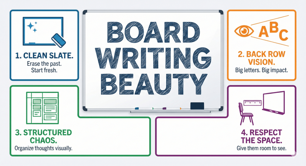
As a professional educator, your lesson begins the moment you step into the room, even before the first word is spoken. I have made it a career-long ritual to ensure the board is pristine. Even if the previous instructor was diligent, I take the time to wipe it from edge to edge. During the peak of seminar seasons, boards often develop a “ghosting” effect—a gray residue from constant use. In such cases, using a dedicated whiteboard cleaner is essential. Whether you use a modern dry-erase board or a traditional blackboard (known affectionately as a “Ruffle” in Kagoshima), starting with a blank, radiant canvas signals to your students that this lesson is a fresh, high-value experience.
Eliminating Cognitive Load: The Danger of Clutter
One of the most common mistakes made by novice teachers is attempting to conduct a lesson while the board is still cluttered with remnants of the previous hour or student graffiti. Because the board is behind the teacher, it is easy to forget its state. However, for the student, it is a constant source of “visual noise.”
Imagine a student trying to focus on complex mathematical formulas while a drawing of a popular character or a list of foreign vocabulary words lingers in their peripheral vision. This creates unnecessary cognitive load, forcing the brain to filter out irrelevant information rather than absorbing the lecture. Furthermore, when the lesson transitions into “life skills” or character-building discussions—topics that require deep emotional resonance—a cluttered board is a distraction. To give your words the weight they deserve, clear the stage. Silence and a blank board command a unique kind of respect.
Visibility is an Act of Empathy
A recurring issue in classroom observations is the “small text” phenomenon. Teachers often write at a size that is comfortable for them, standing just inches away. But the true test of board writing is the perspective of the student in the very last row. If your handwriting requires a student to squint, you have already lost a portion of their attention.
Visibility is a fundamental act of empathy. Before you finalize your board layout, walk to the back of the room. Can you read your notes clearly? Is the contrast sharp enough? In larger lecture halls, your writing must become “larger than life.” Choosing the right markers, maintaining a consistent font size, and ensuring your body doesn’t block the view while you write are all technical skills that fall under the umbrella of “Board Writing Beauty.”
The Geometry of Authority: Mastering Lines and Circles
The physical act of writing on a board requires a different set of motor skills than writing on paper. To command a classroom, your visual aids must project stability and mastery. This is most evident in the way a teacher draws lines and circles. A shaky line or a lopsided circle can subtly undermine a teacher’s perceived authority, especially in technical subjects like geometry or physics.
I often share a specific technique: when drawing a long horizontal line, I place the outer edge of my palm (the area below the pinky) against the board to act as a physical stabilizer, sliding it across the surface. For circles, the secret lies in the “follow-through.” Most people draw narrow ovals because they stop the movement too early. A perfect circle requires a deliberate, sweeping motion that connects the start and end points seamlessly. These skills are not innate; they require “deliberate practice.” I spent countless hours in empty classrooms honing these shapes until they became muscle memory.
Structural Integrity: Layout and Organization
A whiteboard should never look like a chaotic “brain dump.” Even if you follow the standard top-left to bottom-right flow, without a pre-planned structure, your writing may start to slant or intrude into other sections. This visual chaos makes it difficult for students to take organized notes.
If you struggle with spatial management, try the “Divided Board” technique. Before the students arrive, use a faint or dotted line to divide the board into three or four vertical columns. This framework forces you to organize your lecture linearly and prevents the dreaded “downward slant.” Additionally, consider your writing speed. If you write too slowly, you lose the rhythm of the class; if your handwriting is “childish,” it can diminish the perceived value of your expertise. Professionalism is found in the details of your script.
The Professional “Product”: A Lesson in Precision
I once spent a significant amount of time drawing a detailed diagram of the human heart. I was so satisfied with the result that I shared a photo of it online. Soon after, a university senior—who had become a cardiologist—pointed out several anatomical errors. It was a humbling reminder that our board work is a “product” we deliver to our customers (the students).
Just as a company would not sell a defective product, a teacher should not present inaccurate or sloppy visuals. Every diagram, every formula, and every sentence is a reflection of your dedication to the craft.
The Ergonomics of Learning: Beyond the Board
Finally, we must consider the physical environment. Even a perfectly written board is useless if the classroom ergonomics are poor. I once analyzed a photo of a classroom that looked perfect—bright lights, a smiling teacher, and a clean board. However, the first row of students was positioned far too close to the front.

From that proximity, a student must strain their neck upward, leading to physical discomfort and fatigue. Furthermore, they cannot see the entire width of the board without constant head movement. As a rule, there should be at least an 80cm gap between the board and the first row of desks. By reducing physical stress, you maximize the students’ capacity for mental retention.
The Answer to the QUIZ: Is your whiteboard Easy to Read (Beautiful)?
A Hint for Tomorrow
Reflect on this: “How does the act of ‘standing in the student’s shoes’ transform your approach to the whiteboard? Consider visibility, structural layout, and the physical comfort of the learner.”
【日本語要約】 ホワイトボードは教室の「メインスクリーン」であり、その美しさは授業の没入感を左右します。前の授業の残骸や落書きを消すことは、生徒への敬意とプロ意識の象徴です。視覚的ノイズを排除し、最後列の生徒まで届く文字の大きさを意識することは、教育における「共感」そのものです。直線や円を正確に描く技術、領域を分割するレイアウト術、そして生徒の身体的負担を減らす机の配置(80cmの法則)など、物理的な配慮が学習効果を最大化します。板書は「商品」であり、常に最高品質を目指すべきです。
【简体中文摘要】 白板是教室的“主荧幕”,其美感直接影响课堂的沉浸感。清除前一节课的残留内容或涂鸦,不仅是专业精神的体现,更是对学生的尊重。消除视觉干扰,并确保最后一排学生也能看清文字,这是教学中“同理心”的表现。通过练习绘制直线和圆、利用分栏布局以及保持至少80厘米的课桌距离来减轻学生的身体疲劳,这些物理细节能显著提升学习效果。板书即“商品”,教师应像打磨产品一样追求板书的准确与美观。
【한국어 요약】 화이트보드는 교실의 ‘메인 스크린’이며, 그 시각적 완성도는 수업의 몰입도를 결정합니다. 이전 수업의 흔적이나 낙서를 깨끗이 지우는 것은 학생에 대한 예의이자 전문가로서의 첫걸음입니다. 시각적 소음을 제거하고 마지막 줄 학생까지 배려한 글자 크기를 유지하는 것은 교육의 기본인 ‘공감’을 실천하는 일입니다. 직선과 원을 그리는 숙련된 기술, 체계적인 레이아웃, 그리고 학생의 피로도를 줄이는 책상 배치(80cm 법칙)와 같은 물리적 배려가 학습 효과를 극대화합니다. 판서는 하나의 ‘상품’이며, 교사는 항상 최상의 품질을 제공해야 합니다.
【Résumé en français】 Le tableau blanc est l’écran principal de la classe, et sa clarté détermine l’immersion des élèves. Effacer les traces du cours précédent est un signe de respect et de professionnalisme. Éliminer le “bruit visuel” et adapter la taille de l’écriture pour les élèves du dernier rang est un acte d’empathie pédagogique. La maîtrise des lignes, une mise en page structurée et le respect d’une distance de 80 cm entre le tableau et le premier rang pour réduire la fatigue physique sont essentiels. Le tableau est un “produit” éducatif qui exige précision et esthétique pour maximiser l’apprentissage.
【Deutsche Zusammenfassung】 Das Whiteboard ist die „Leinwand“ des Klassenzimmers, deren Sauberkeit die Konzentration der Schüler maßgeblich beeinflusst. Das vollständige Löschen alter Notizen ist ein Zeichen von Professionalität und Respekt. Visuelle Störfaktoren zu eliminieren und die Schriftgröße auf die hinterste Reihe auszurichten, ist gelebte Empathie. Technische Fertigkeiten wie gerade Linien, eine strukturierte Aufteilung und die Einhaltung eines Abstands von 80 cm zur ersten Reihe minimieren die physische Belastung der Lernenden. Ein Tafelbild ist ein „Produkt“, das durch Präzision und Ästhetik den Lernerfolg sichert.
【Suomenkielinen yhteenveto】 Valkotaulu on luokkahuoneen ”päänäyttö”, ja sen selkeys vaikuttaa suoraan oppilaiden keskittymiseen. Edellisen tunnin merkintöjen pyyhkiminen on kunnioitusta oppilaita kohtaan ja ammattitaidon osoitus. Visuaalisen hälyn poistaminen ja tekstin koon sovittaminen takarivin oppilaille on pedagogista empatiaa. Suorien viivojen piirtäminen, selkeä asettelu ja oppilaiden fyysisen rasituksen vähentäminen (80 cm etäisyys tauluun) maksimoivat oppimisen. Taulutyöskentely on ”tuote”, jonka laatu ja tarkkuus heijastavat opettajan asiantuntemusta.
【हिंदी सारांश】 व्हाइटबोर्ड कक्षा का “मुख्य स्क्रीन” है, और इसकी सुंदरता छात्रों की एकाग्रता को निर्धारित करती है। पिछली कक्षा के अवशेषों या रेखाचित्रों को मिटाना छात्रों के प्रति सम्मान और पेशेवर दृष्टिकोण का प्रतीक है। दृश्य विकर्षणों को दूर करना और अंतिम पंक्ति के छात्र तक स्पष्ट रूप से पहुंचने वाले अक्षरों का उपयोग करना शिक्षण में “सहानुभूति” का प्रदर्शन है। सीधी रेखाएं और वृत्त बनाने का कौशल, व्यवस्थित लेआउट, और छात्रों के शारीरिक तनाव को कम करने के लिए डेस्क की उचित दूरी (80 सेमी नियम) सीखने के प्रभाव को अधिकतम करते हैं। बोर्ड लेखन एक “उत्पाद” है, जिसकी गुणवत्ता हमेशा उच्चतम होनी चाहिए।

